Colour is a powerful and emotive force, and we go to great lengths to provide clients with colour assurance because of the potential for disparity between the colour experienced on screen versus that experienced in reality.
Yet, ultimately, experiencing colour is in fact completely dependent on its physical, visual, artistic, and cultural context.
Despite an entire industry’s best efforts to name and codify colours, whether that be with the Pantone, RAL or NCS systems, they constantly shift in response to light and space. An environment can affect a colour as much as a colour affects our environments. It’s the reason why the paint you choose always looks different on a wall than it did on the paint chip.
Colour pigments interact with light and hence colours take on different hues depending on the time of the day and the brightness and temperature of light.
Our brains respond to stimuli produced when incoming light reacts with various cone cells in our eyes, but colours appear differently based on the other colours they’re paired with, the materials they’re used on, the shape of an object or space they are in, and the quality of light.
In the case of natural light, that means colours even change in hue over the course of a single day. A colour might look differently in the warm morning light than it does in the cooler light in the evening or, obviously, the dark. They might change subtly or drastically depending on the pigment.
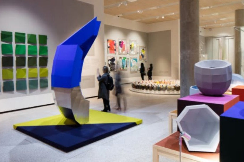
A wonderful new exhibition at the Design Museum in London, this concept - known scientifically as metamersim - is wonderfully illustrated, not least by a series of multi-faceted vessels by Hella Jongerius.
The angled surfaces each differently capture and reflect the colours of the surfaces they are placed, so each panel appears to be a slightly different hue than its neighbour, even though they are all rendered in the same colour.
So, whilst we believe in providing you with the best colour assurance possible, you might like to reflect on the idea that colours can’t actually be controlled. As the exhibition designer Alex Newson says: “You can select colours based on expected performance, but they will usually surprise you. It’s better to be freer in how we can enjoy colour, and the idiosyncrasies and unexpected elements of colour.”
Receive invitations to exhibitions, new collection previews, exclusive stockroom sales and more...
© 2026 Signarture Pty Ltd | ACN 116 872 194 | art@signarture.com | +61 2 8001 6141


