Well, our predictions were at least half right.
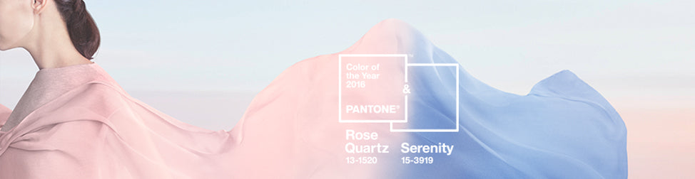
For the first time, Pantone have announced the blending of two colours, Rose Quartz and Serenity - a calming blue - as their colour of the year for 2016.
Blended and graduated colour tones have been a popular trend over the last few years and the driving force behind their choices is always to reflect what is taking place in our culture, to express a mood and an attitude. As we thought, this year that reflects the yearning for calming tones as an antidote to our fast paced, technology dominated and uncertain lives.
According to Pantone's official press release "as consumers seek mindfulness and well-being as an antidote to modern day stresses, welcoming colors that psychologically fulfill our yearning for reassurance and security are becoming more prominent."
"Joined together, Rose Quartz and Serenity demonstrate an inherent balance between a warmer embracing rose tone and the cooler tranquil blue, reflecting connection and wellness as well as a soothing sense of order and peace." says Leatrice Eiseman, Executive Director, Pantone.
Highly appropriate colour choices for our turbulent times.
Receive invitations to exhibitions, new collection previews, exclusive stockroom sales and more...
© 2026 Signarture Pty Ltd | ACN 116 872 194 | art@signarture.com | +61 2 8001 6141


