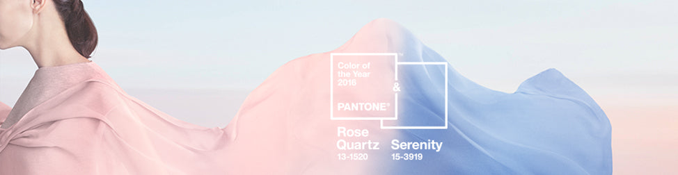
Well, our predictions were at least half right.
For the first time, Pantone have announced the blending of two colours, Rose Quartz and Serenity - a calming blue - as their colour of the year for 2016.
Blended and graduated colour tones have been a popular trend over the last few years and the driving force behind their choices is always to reflect what is taking place in our culture, to express a mood and an attitude. As we thought, this year that reflects the yearning for calming tones as an antidote to our fast paced, technology dominated and uncertain lives.
According to Pantone's official press release "as consumers seek mindfulness and well-being as an antidote to modern day stresses, welcoming colors that psychologically fulfill our yearning for reassurance and security are becoming more prominent."
"Joined together, Rose Quartz and Serenity demonstrate an inherent balance between a warmer embracing rose tone and the cooler tranquil blue, reflecting connection and wellness as well as a soothing sense of order and peace." says Leatrice Eiseman, Executive Director, Pantone.
Highly appropriate colour choices for our turbulent times.
Signarture Creative Director, Sarah Leslie, was asked by Houzz, the leading international platform for home design and renovation, to predict which colour might be chosen as Pantone Colour of the Year for 2016...
Her thoughts, alongside those of other professional interior designers, decorators and colour consultants, were published in the Houzz article above, and can be read in full below.
Pantone is widely regarded as the global authority on colour, and Executive Director Leatrice Eiseman’s predictions are global, and used across a multitude of industries.
Since the neutral ‘Sand Dollar’ in 2006, a succession of highly saturated hues have been nominated as Pantone ‘Colour of the Year’. Marsala in 2015 was perhaps their most surprising choice yet. With many of us yearning for quieter, calming tones as an antidote to our fast paced, technology dominated lives, it could be time for a more approachable, less saturated colour. Indeed US Paint manufacturer Benjamin Moore has named ‘Simply White’ as their colour of 2016 but our bet is that Pantone chose one of the colours they’ve already highlighted within their top 10 for Spring 2016 forecast specifically for the Fashion RTW.
I’d like to see ‘Lilac Gray’ or ‘Rose Quartz’ take the title. Grays are being forecast strongly into Autumn Winter, as are pinks. We all know that fashion trends filter through to the home with increasing rapidity, and ‘Pink Dogwood’ is a more blush tone than ‘Rose Quartz’ that features in the Pantone’s Home & Interior ‘Ephemera’ palette for 2016.
Eiseman looks for colors in their ascendancy, “colours that are being used in broader ways and broader context than before”. The most pre-ordered colour for the recently released iPhone 6S was, reportedly, from men and women alike, the new ‘Rose Gold’... that’s broadening the context for rose/blush/quartz pink!
If they decide against calm and instead to up the ante, ‘Buttercup’ (Yellow) would have to be a strong contender.
Receive invitations to exhibitions, new collection previews, exclusive stockroom sales and more...
© 2026 Signarture Pty Ltd | ACN 116 872 194 | art@signarture.com | +61 2 8001 6141


