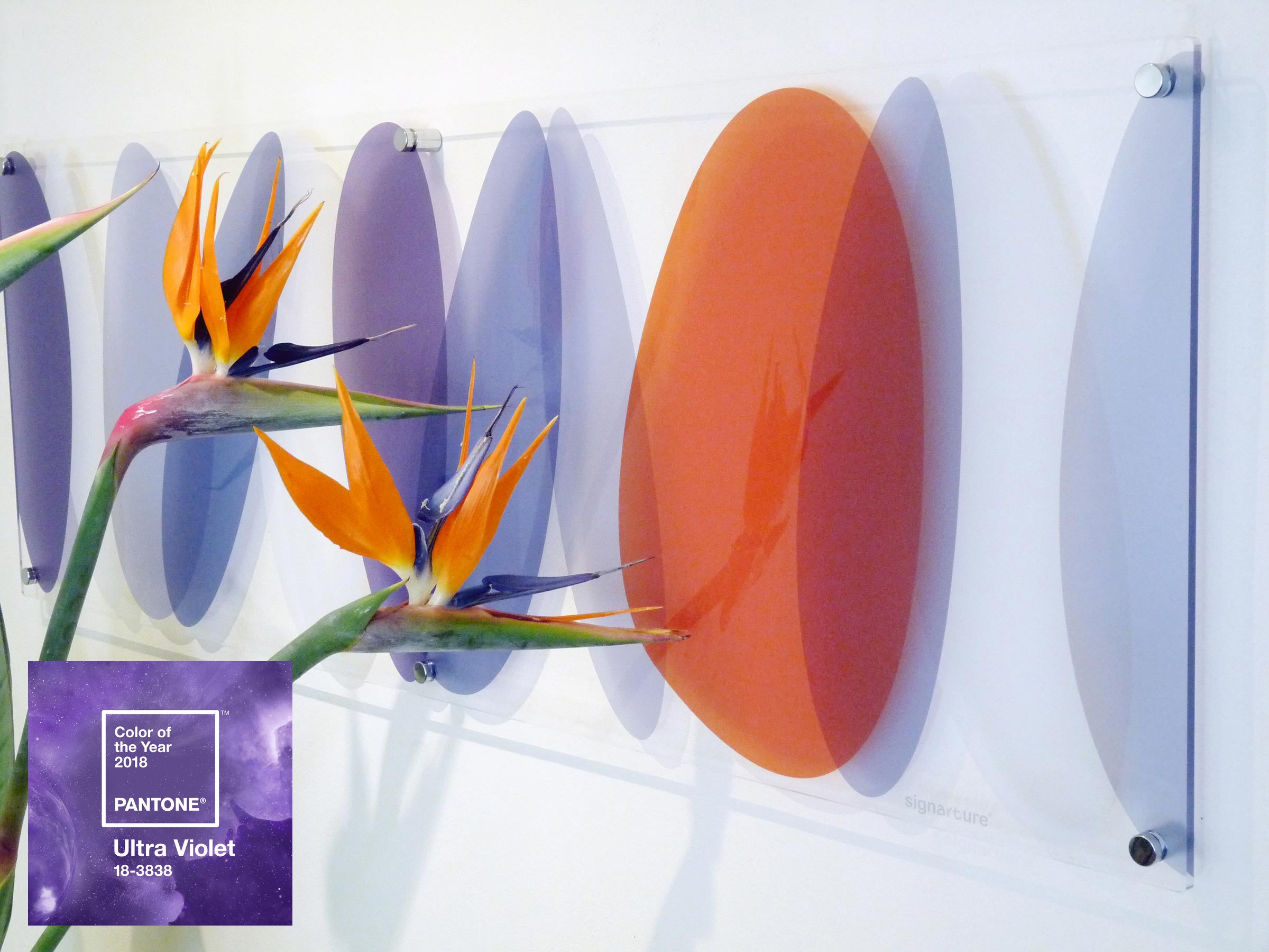
Pantone, the global colour authority, have just announced their 'Colour of the Year' for 2018: Ultra Violet 18-3838. Symbolic of the prevalent global culture, the colour of the year is an expression of the collective mood and attitude.
We are living in times that require inventiveness and imagination and, according to the Executive Director of the Pantone Colour Institute, Leatrice Eiseman, ultra violet communicates originality, ingenuity, and visionary thinking that points us toward the future.
The colour is certainly provocative, and dominant. In an interior, it can easily overpower other elements and as such ultra violet requires careful coordination. It is perhaps best used as an accent colour, introduced through decorative elements such as artworks, so as not to overwhelm.
We took inspiration from nature, pairing the an ultra-violet hue with complementary deep oranges and citrus greens when creating new colourways for our popular 'Lhotse' design.
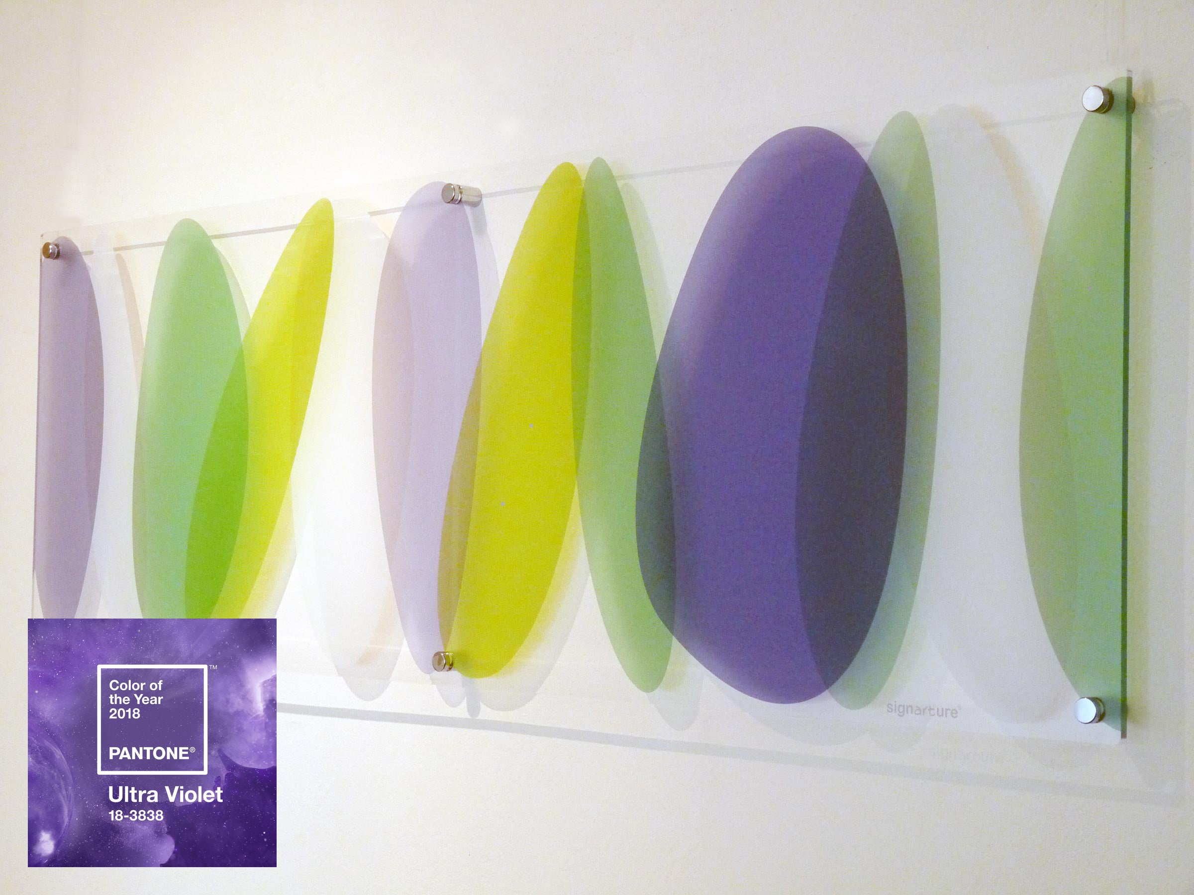
Fittingly, lhotse is a design from our Aura collection, which features organic forms in meditative arrangement. The color is often associated with mindfulness practices, which offer a higher ground to those seeking refuge from today’s over-stimulated world, and the use of purple-toned lighting in meditation spaces and other gathering places energizes the communities that gather there and inspire connection.
As Pantone state, as a color that can take you in so many directions, Ultra Violet makes a statement in any space, whether it’s one of tradition and elegance or contemporary boldness.
Receive invitations to exhibitions, new collection previews, exclusive stockroom sales and more...
© 2026 Signarture Pty Ltd | ACN 116 872 194 | art@signarture.com | +61 2 8001 6141


